There has been a tectonic shift in the way people are viewing your website. Have you noticed it? Several years ago, your site traffic was mostly from desktop computers. Today, a significant percentage of visitors are probably arriving via mobile devices. That should come as no big surprise, given the meteoric rise of smart phones and tablets. And let’s face it, any traffic is good, regardless of how they got there – but only if they’re converting to customers. The problem for most sites is that they’re not, at least not nearly as well as desktop visitors.
Fortunately, there’s a fix.
The Problem
So why aren’t mobile users converting? To put it bluntly, browsing most Site Builder sites on a small screen is a pain and they’re not sticking around long enough to buy. Out of the box, the techniques Netsuite uses to present web data were designed well before the rise of mobile devices. For desktop users, that’s fine. For visitors using a phone or tablet, however, the experience can be frustrating. Mobile web browsers try to cope with a page that’s designed for desktop only by shrinking it down to fit their screens. The result is minuscule text that’s nearly unreadable and equally small images. To see anything clearly requires pinch-zooming , and scrolling around on the page to try and take it all in.
To make matters worse, Google has also noticed that your site isn’t mobile-friendly. On April 21, 2015, they started rolling out a new algorithm, dubbed “mobilegeddon” by some, that takes note of whether sites being crawled are mobile friendly or not, and lowers the rankings of those that aren’t. So while some mobile users are having a rough time browsing your site, others might not even be finding it to begin with.
The Solution
Now for some good news. Making a SiteBuilder site mobile friendly, both for your users and in the eyes of Google, is within your reach. The key lies in an area of web development called responsive design, which is shorthand for changes to the layout and styling of your site that allow it to better utilize small screens.
At Fourth Wave, we’ve been able to make Netsuite sites responsive with relatively few template changes, while relying on updates to the stylesheets (CSS) instead.
Considerations
When converting a desktop site to responsive, efficient use of the screen real estate is key. Elements that might have been prominent (the logo, search boxes, or top-level navigation) need to remain available while taking up considerably less space. We’ve developed a basic checklist of considerations for successful responsive conversions.
Common Elements
Our first focus is on the common elements that are present on all pages. For most sites, this will include the header, footer, and persistent navigation. By addressing these first, we make significant progress toward a mobile-friendly site by editing just a few files.
Header
The header most likely holds the initial branding of your site, along with some utility links such as cart, my account, and a search box. We’ve had the best luck with creating a new mobile version of the header and using CSS media queries to swap out the desktop header for mobile depending on screen size.
In some cases, we’ve also included some scripting to allow the header to collapse as the page is scrolled down, leaving the essential utility links while sliding the logo and non-essential links off screen. This reserves most of the screen for the content.
The search box is collapsed to an icon, pressing which will slide out the search form. Again, the strategy is hide anything that distracts from the content, but have it at the ready when needed.
Navigation
Navigation is perhaps the most complex element to make responsive. Our strategy is to create an alternate static navigation panel, hard-coded in HTML, and keep it off screen until needed. The developing standard is to use a “hamburger” icon to denote navigation. In the interest of usability, we usually include text labels below the button as well, although it’s possible that at some point the functionality will be obvious enough to drop those.
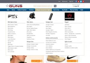
Since we’re creating a static navigation pane anyway, several of our clients have taken advantage of the opportunity to beef up their desktop navigation as well by using a responsive mega menu. This allows for images, in-depth menus at a single glance, and marketing messages or guidance, all wrapped in a neat package that scales responsively.
Footer
Lastly, literally, comes the site footer. Most of our clients already had this in place, although in several cases we suggested moving links such as “About Us” or “Locations” from the header to the footer, again to conserve space. Since the footer is off screen by default until scrolled to, there’s no need for scripting to hide it. It helps to use a different background color, just to differentiate it from the content.
While we find using multiple columns in the desktop version of the footer is a good idea, for small screens – especially in portrait mode – we stack those columns atop one another to make a single scrolling column.
Grid Layouts
Once the header, nav, and footer are in place and working, we move on to more template-specific issues. One of the biggies that needs to be sorted out are any gridded layouts, such as category lists, product lists, and search results.
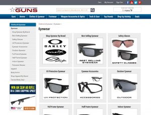
This is where some CSS kung-fu comes in. Netsuite loves layout tables, but tables are notoriously difficult to make responsive. Our workaround involves taking a mobile-first approach; we rework the layouts in SiteBuilder so that they’re presented as single-column lists. This means only one table cell per row, which isn’t efficient for desktop screens but is nearly a requirement for mobile. Then we use CSS to float the rows so that they appear side-by-side if there’s room, and stack if there’s not.
Other Content
Fixing the above elements will take you about 90% of the way to a fully responsive site. From there you need to decide if any individual page contents will need tweaks to make them responsive. Complex tabular data, such as product configuration tables, can be a pain to deal with. Fortunately, they’ve been few and far between in our experience. Any videos or forms that are contained in iframes will need to be restyled to fit smaller screens, which isn’t too tough but is a bit wonky to discuss here. And then of course, there are the last three Netsuite page types…
Shopping Cart, Checkout, & My Account Pages
Using CSS only to make the standard NS Cart, Checkout, and My Account pages presents some challenges. You can bang away at them and after some trial and error get a layout that flows okay on mobile, or bite the bullet and install the freely available Reference Cart, Checkout, and My Account bundles. The latter option means fewer headaches as far as responsiveness goes, but they’re not trivial to set up and get working. Having done it both ways, we tend to come down on the side of the reference options.
Conclusion
Converting a SiteBuilder site to a mobile-friendly, Google-approved layout isn’t the simplest project, but with some practice it’s very doable and the payoff is most definitely worth the effort. If you do it right, you’re also fairly well future-proofed against the constant barrage of new devices entering the market. Hopefully this post will help you organize your thoughts before setting off on the journey. And if the trip just sounds like too much work, contact us and we’ll be happy to discuss the project with you.
More from Fourth Wave
Bill Womack
Latest posts by Bill Womack (see all)
- Making Netsuite Site Builder Friendly for Mobile Users - May 17, 2016







Hi There
ive created custom ssps which are responsive but the standard netsuite site builder template isnt, do you have anything you can send to me that I can use thats responsive please?
kind regards
Dave
I’ll email you separately, but the short answer is that it takes a good deal of custom coding to make Site Builder responsive. We have converted 4 Site Builder sites so far, and each one required its own custom-built solution to work with their pre-existing customizations. The general process involves recasting table data cells as divs, and using a single column layout that we use CSS to float, so it can expand to 3 columns wide or collapsed down to one column, depending on the viewport.